

Frames & Forms: Wes Anderson & Symmetry as a Lifestyle
Frames & Forms is our ongoing series tracing the unexpected kinship between cinema and design. In Part II, we step into the meticulous worlds of Wes Anderson - pastel, symmetrical, and strangely sincere. These are not just films, but environments so exacting they’ve come to redefine what we think design can be.
A Total Work of Art
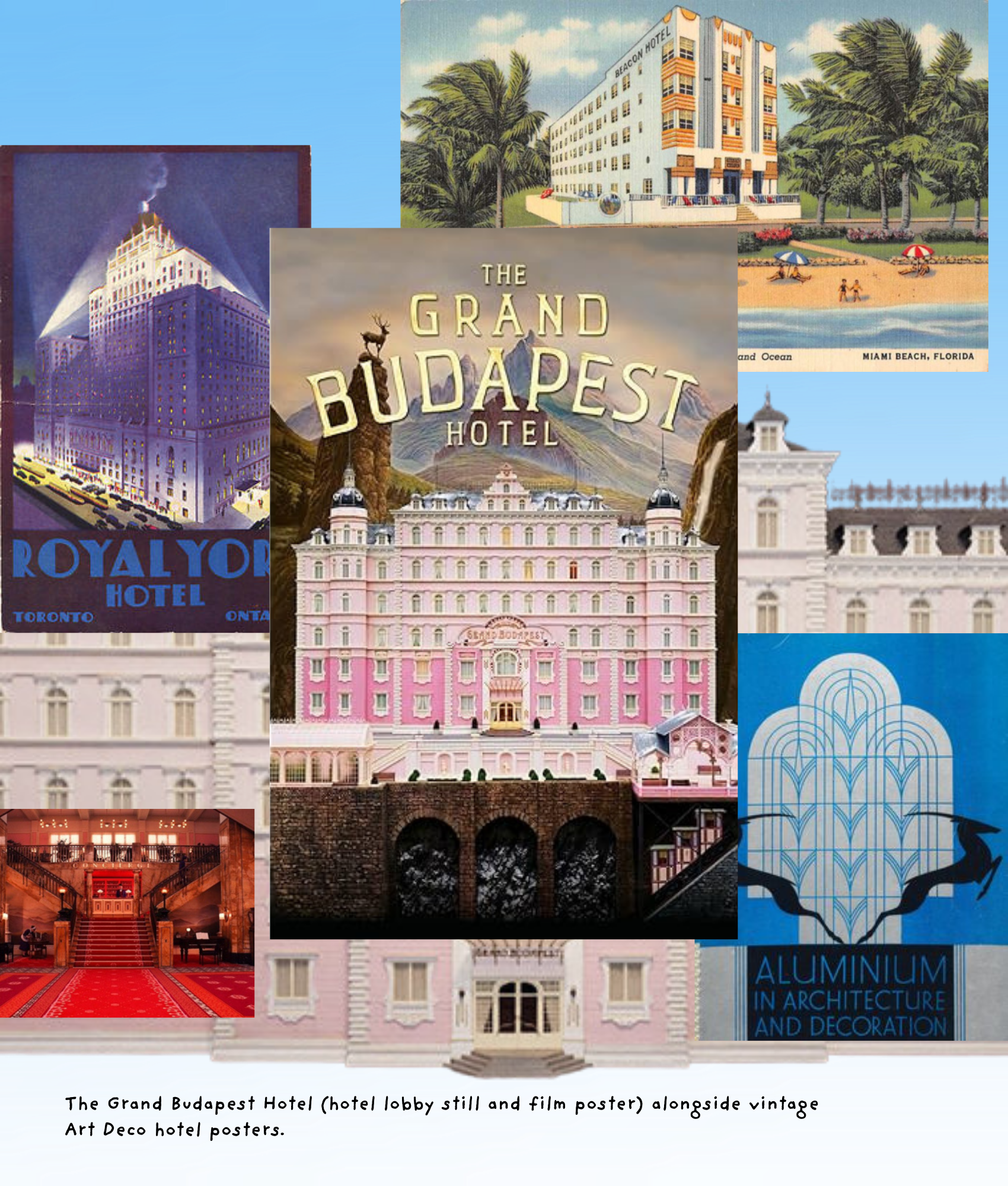
The term Gesamtkunstwerk - “total work of art” - belonged originally to Wagner’s operas and the Bauhaus, but it could just as easily describe Anderson’s films. In The Grand Budapest Hotel (2014), every pastry box, elevator dial, and lobby wall is orchestrated like a symphony. His cinema is design-forward to the point that architecture, props, and color feel like co-stars.
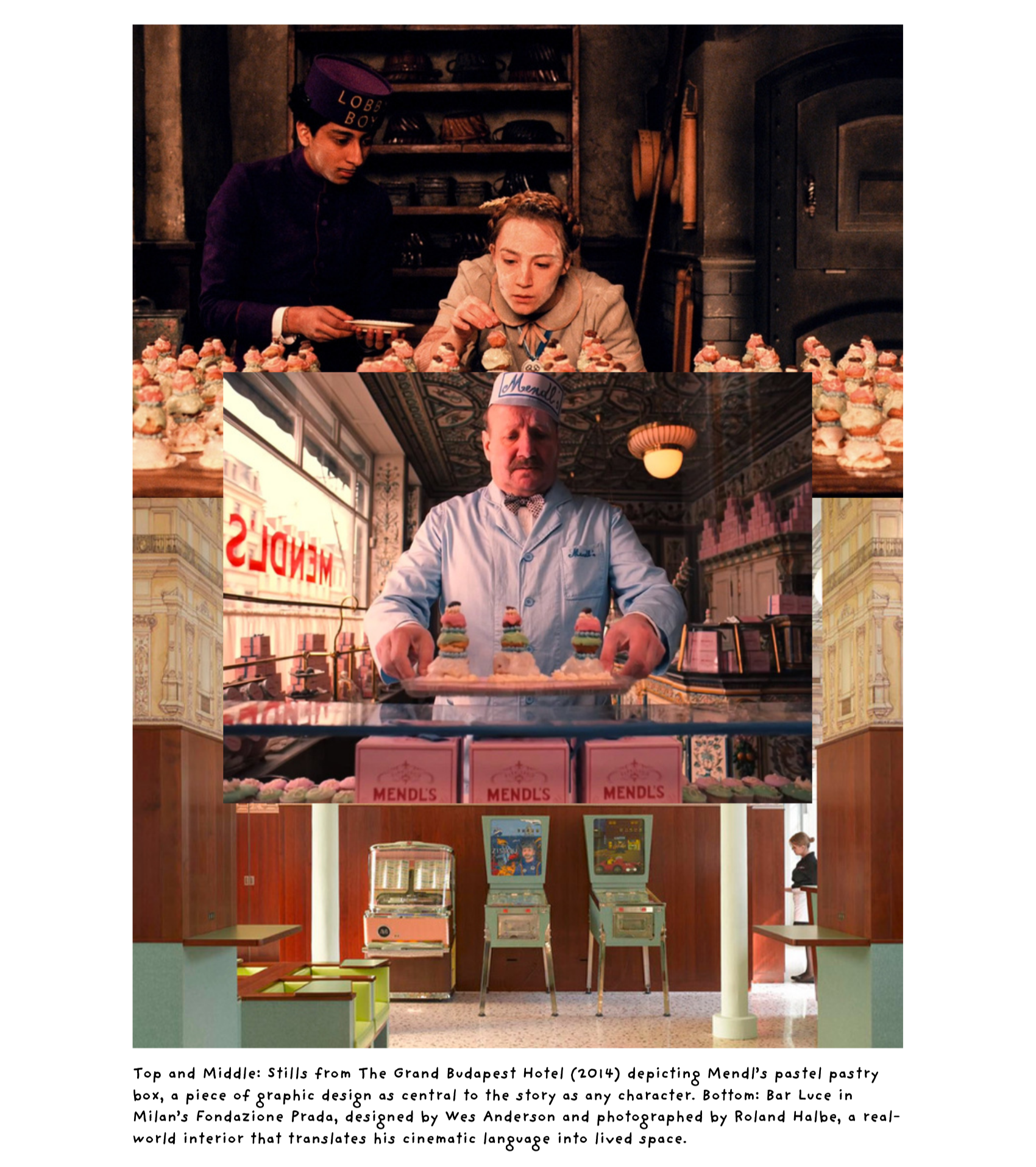
Anderson’s collaborators - production designer Adam Stockhausen, set decorator Anna Pinnock, graphic designer Annie Atkins - create environments that are not merely backdrops but narrative machines. A Mendl’s pastry box, with its pink-and-blue packaging, conveys an entire world of sweetness and fragility. The film’s fictional signage, postage stamps, and uniforms embody a graphic design system as robust as any luxury brand.
Symmetry as a Moral Compass
Anderson is famous, sometimes infamous, for symmetry. Centered compositions, balanced proportions, and near-mathematical framing recur throughout his films, from Rushmore (1998) to Asteroid City (2023).
Symmetry here is more than style. In The Royal Tenenbaums (2001), it creates the sense of a diorama: a family museum where every character is frozen in his or her own display case. In Moonrise Kingdom (2012), symmetry conveys innocence, a childlike belief that the world can be orderly. In The Grand Budapest Hotel, it becomes a way of holding chaos at bay, an aesthetic attempt to impose elegance on tragedy.
This architectural symmetry recalls Palladian villas, neoclassical theaters, and even Le Corbusier’s modular rigor. It also resonates with modernist graphic design’s love of grids. Anderson’s films function like moving Mondrians - compositions in which the human drama is one more block of color.
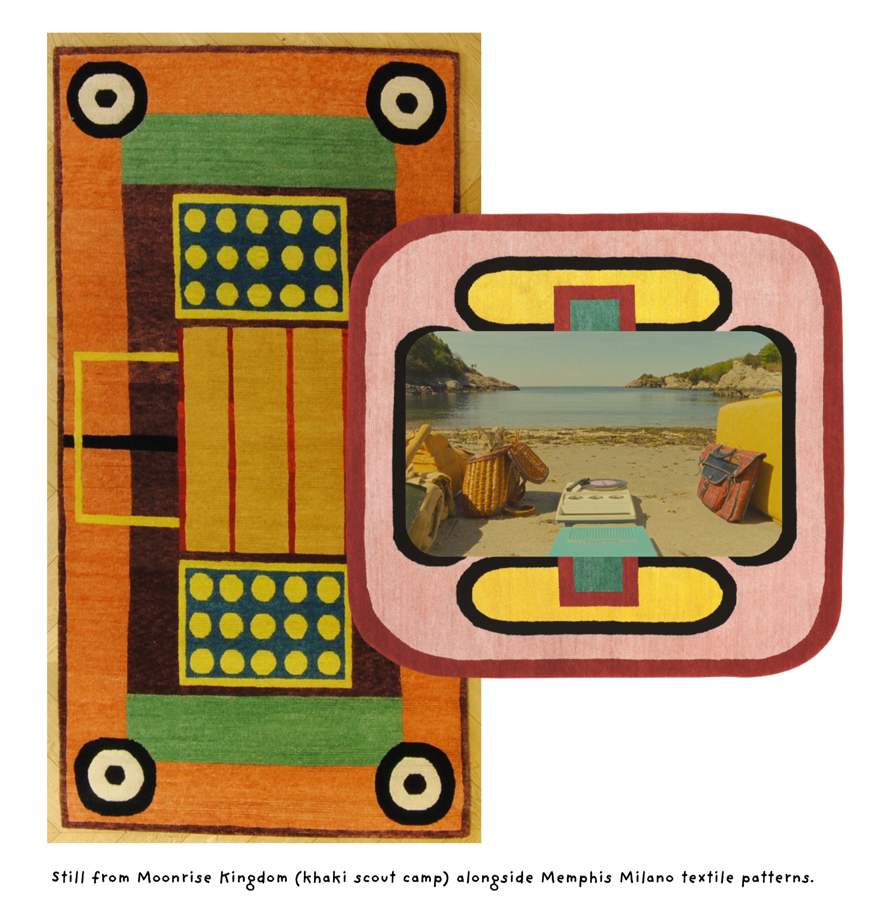
A Postmodern Palette
If his compositions recall modernism, Anderson’s palette embraces postmodern play. Dusty pink, mustard yellow, faded teal, robin’s egg blue: colors pulled not from nature but from nostalgic packaging and mid-century interiors.
The confectionary tones of The Grand Budapest Hotel echo Art Deco hotels and Alpine resort posters. The Life Aquatic with Steve Zissou (2004) draws on the bright blues and reds of nautical uniforms. The French Dispatch (2021) channels the muted inks of vintage magazines.
These palettes resonate with postmodern design movements - especially Memphis Milano. While Anderson’s world is tidier than Memphis’s exuberant chaos, they share a rejection of neutrality. Both insist that color is narrative: not background, but emotion, character, and point of view.
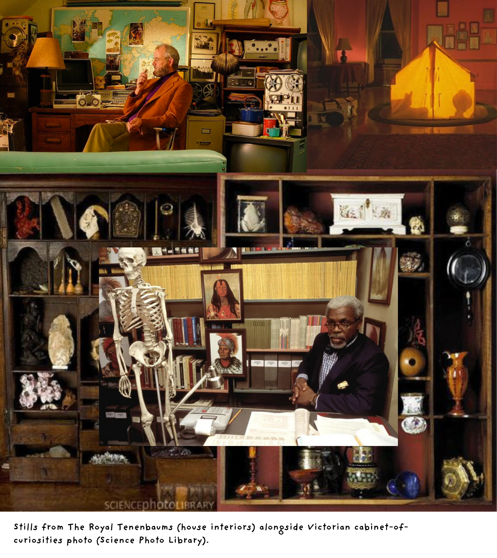
Sets as Living Museums
Anderson’s sets often feel like design exhibitions. The house in The Royal Tenenbaums is a Victorian townhouse turned cabinet of curiosities. Fantastic Mr. Fox (2009), though animated, is filled with miniature interiors that resemble handmade dioramas. Asteroid City (2023) collapses theater, desert landscape, and model-making into a hall of mirrors.
Critics often accuse Anderson of fetishizing objects - of creating worlds too polished, too aesthetic. But what if that fetish is the point? In an age where so much design aims for effortless “authenticity,” Anderson’s films argue that artifice itself can be moving. He treats objects with reverence, like museum artifacts, giving them narrative weight.
The Influence Beyond Film
Unlike Lynch, whose influence circulates atmospherically, Anderson’s has been almost literal. His aesthetic has spawned Instagram accounts (“Accidentally Wes Anderson”), coffee-table books, even hotels and cafés designed to mimic his look. The pastel interiors of Stockholm’s Hotel Diplomat or the immersive experience of the “Bar Luce” in Milan’s Fondazione Prada (designed by Anderson himself) testify to his direct impact on real-world design.
Graphic design has followed suit: bold, centered typography, vintage-inspired signage, and hand-drawn illustrations abound in boutique branding. Interiors echo his color schemes and decorative layering. His style has been critiqued as twee or overdone, but its persistence suggests that people long for environments with personality, narrative, and order.
Why It Matters
Wes Anderson proves that design can be cinematic and cinema can be designed. He collapses the line between film and built environment, reminding us that every interior, every graphic, every color tells a story. His insistence on symmetry and artifice may seem fussy, but beneath it lies a conviction: that beauty, carefully arranged, can hold the chaos of life.
In a cultural landscape often obsessed with minimalism and efficiency, Anderson’s world is unapologetically maximalist and ornamental. It gives permission for design to be playful, sincere, and idiosyncratic - a reminder that order and whimsy are not opposites but partners.